Embedded Checkout SDK reference
Overview
Embedded Checkout adds a global Checkout object with two methods:
initiate: Renders the full Embedded Checkout experience with all configured payment methods.express: Renders Embedded Express, a wallet-only variant that displays Apple Pay, Google Pay, and Samsung Pay.
export type CheckoutOptions = {
  /**
   * Checkout id retrieved from an API call to /v2/checkout
   */
  checkoutId: string;
  /**
   * Entity id, needs to match the entity id used to create the checkout.
   */
  key: string;
  /**
   * Options for the Checkout UI.
   */
  options?: {
    /**
     * Custom ordering of payment methods.
     *
     * e.g.
     * {
     *  card: 1,
     *  mobicred: 2,
     *  payflex: 3,
     * }
     *
     */
    ordering?: Record<string, number>;
    /**
     * Configure which payment methods (https://developer.peachpayments.com/docs/pp-payment-methods#south-africa) are shown to the customer without making changes to your Peach Payments account configuration.
     *
     * Although you can specify both `include` and `exclude` at the same time, it's more likely you'd want to do one or the other.
     *
     * @example
     * {
     *  include: ["CARD", "MOBICRED"],
     *  exclude: ["PAYFLEX"],
     * }
     */
    paymentMethods?: {
      /**
       * Include specific payment methods.
       */
      include?: string[];
      /**
       * Exclude specific payment methods.
       */
      exclude?: string[];
    };
  };
  /**
   * Event handlers.
   *
   * Hook into Checkout events, and perform actions when they occur.
   */
  eventHandlers?: {
    /**
     * Event handlers fired when Checkout has completed successfully.
     * @param event Details about the transaction.
     * @returns Void
     */
    onCompleted?: (event: CompletedCheckoutEvent) => void;
    /**
     * Event fired when Checkout has cancelled by the user.
     * @param event Details about the Checkout.
     * @returns Void
     */
    onCancelled?: (event: CheckoutEvent) => void;
    /**
     * Event fired when Checkout has timed out.
     * @param event Details about the Checkout.
     * @returns Void
     */
    onExpired?: (event: CheckoutEvent) => void;
    /**
     * Event fired just before submission of a payment.
     *
     * Can be used to block the payment from being submitted.
     * Return true to allow payment, anything else (including no return) blocks it and shows an error message to the user.
     * For blocked payments, the parent page should handle redirecting or unmounting checkout.
     * If not handled, an error message is shown to the user.
     *
     * @example
     * onBeforePayment: async () => {
     *   try {
     *     const isValid = await validatePayment();
     *     if (isValid) return true;
     *     throw new Error("Product out of stock!");
     *   } catch (error) {
     *     // Payment blocked, parent page should handle redirect/unmount
     *     // Handle redirecting or unmounting
     *   }
     * }
     *
     * @returns {true|Promise<true>|void} True to proceed with payment, anything else (or no return) to block it
     */
    /**
     * Event fired when a transaction has failed.
     * @param event Details about the failed transaction.
     * @returns Void
     */
    onError?: (event: CheckoutEvent) => void;
    onBeforePayment?: () => true | Promise<true> | void;
    /**
     * Event fired when a stored card should be removed.
     * @param token The token of the card to remove.
     * @returns {boolean|Promise<boolean | void>|void} Return true/Promise<true> to indicate that the card was removed successfully, anything else (or no return) to indicate that the card was not removed successfully
     */
    onRemoveCard?: (
      token: string
    ) => Promise<undefined | boolean> | undefined | boolean;
  };
  /**
   * Customisations for the UI.
   */
  customisations?: {
    /**
     * Controls visibility of the cancel button
     * @default true
     */
    showCancelButton?: boolean;
    /**
     * Controls visibility of the amount field
     * @default true
     */
    showAmountField?: boolean;
    /**
     * Custom theme options
     */
    theme?: {
      /**
       * Supports web safe or Google fonts, for example, `TIMES NEW ROMAN`, `MONOSPACE`, and so on.
       */
      fontFamily?: string;
      brand?: {
        primary?: string;
        secondary?: string;
      };
      cards?: {
        background?: string;
        backgroundHover?: string;
      };
    };
    /**
     * Card-specific UI customisation options
     */
    card?: {
      /**
       * Text to display on the submit button
       * @default "Pay Now"
       */
      submitButtonText?: string;
      /**
       * Controls visibility of the card icon
       * @default true
       */
      showCardIcon?: boolean;
      /**
       * Controls enablement of the add card button
       * @default true
       */
      enableAddCard?: boolean;
      /**
       * Text to show above the card payment in an h3
       * @default "Card Payment"
       */
      headingText?:
        | string
        | {
            /**
             * Text to show above the card payment in an h3 when no stored cards are present
             */
            default?: string;
            /**
             * Text to show above the card payment in an h3 when stored cards are present
             */
            savedCards?: string;
          };
      /**
       * List of card brands to show, enabling you to disable and hide card brands without having to change your Peach Payments account configuration.
       * For example, if you are configured for Visa, Mastercard, and Amex, but only want to show and accept Visa, you can do that without having to change your Peach Payments account configuration.
       *
       * If you do not provide any brands (or provide invalid brands), all brands show.
       *
       * @default all brands - ["VISA", "MASTERCARD", "AMEX", "DINERS"]
       */
      brands?: string[];
      /**
       * Controls visibility of the billing fields on card.
       *
       * Overrides the backend configuration.
       * @default true
       */
      showBillingFields?: boolean;
      /**
       * Card registration options
       */
      registrations?: {
        /**
         * Controls visibility of the CVV field when making a one-click card payment.
         * @default false
         */
        requireCvv?: boolean;
        /**
         * Text to show on the button to show stored cards.
         * @default "Back"
         */
        showStoredCardsText?: string;
      };
    };
  };
};

export type RenderCheckout = {
  /**
   * Render Embedded Checkout into an HTML element.
   * @param container ID of the HTML element to render Embedded Checkout into, or a direct reference to the HTML element itself.
   */
  render: (container: string | HTMLElement) => void;
  /**
   * Remove Embedded Checkout from being rendered.
   *
   * NOTE: The same Checkout ID cannot be reused for another render attempt, a new ID will need to be generated.
   */
  unmount: () => void;
};

export type Checkout = {
  /**
   * Initiate a Checkout UI experience.
   * @param options Options for the Checkout experience.
   * @returns An object that can be used to render the Checkout UI or to unmount the Checkout UI.
   */
  initiate: (options: CheckoutOptions) => RenderCheckout;
};
/**
* Options for the Embedded Express experience.
*
* Renders only wallet CTA buttons (Apple Pay, Google Pay, Samsung Pay) with no
* surrounding checkout chrome. Ideal for placing wallet buttons inline on a
* merchant's own page alongside a full checkout instance.
*
* @example
* window.Checkout.express({ key, checkoutId }).render("#express-cta-container");
*/
export type ExpressCheckoutOptions = {
/**
* Checkout ID retrieved from an API call to /v2/checkout
*/
checkoutId: string;
/**
* Entity ID, needs to match the entity ID used to create the checkout.
*/
key: string;
/**
* Event handlers.
*
* Hook into Checkout events, and perform actions when they occur.
*/
eventHandlers?: CheckoutEventHandlers;
};
export type RenderCheckout = {
/**
* Render Embedded Checkout into an HTML element.
* @param container ID of the HTML element to render Embedded Checkout into, or a direct reference to the HTML element itself.
*/
render: (container: string | HTMLElement) => void;
/**
* Remove Embedded Checkout from being rendered.
*
* NOTE: The same Checkout ID cannot be reused for another render attempt, a new ID will need to be generated.
*/
unmount: () => void;
};
export type Checkout = {
/**
* Initiate an Embedded Express UI experience that shows wallet payment methods only
* (Apple Pay, Google Pay, and Samsung Pay).
* @param options Options for the Embedded Express experience.
* @returns An object that can be used to render the Checkout UI or to unmount the Checkout UI.
*/
express: (options: ExpressCheckoutOptions) => RenderCheckout;
};Render
To render Embedded Checkout, initiate the Checkout object and then call checkout.render(...).
The render call takes in the HTML ID of the element in the format #elementID or takes in an HTML element directly:
checkout.render("#peachpayments-checkout");const checkoutElement = document.getElementById("peachpayments-checkout");
checkout.render(checkoutElement);Supporting the HTML element directly is useful in situations where you are using a shadow DOM.
Event handlers
Embedded Checkout supports handling events. When you specify a handler for an event, Embedded Checkout calls that handler event and does not redirect. If you don't specify a handler, Embedded Checkout redirects.
The following events are available:
| Event | Description |
|---|---|
onCompleted | The customer completes a payment and the checkout experience. |
onCancelled | The customer cancels the checkout experience. |
onExpired | The checkout experience expires (customers have 30 minutes to complete a payment). |
onError | Fired when a transaction fails. |
onBeforePayment | Fired before payment submission, allowing you to block the payment if needed. |
onRemoveCard | Fired when the customer tries to remove a stored card, allowing you to remove the stored card from the customer's profile. |
export type CheckoutEventHandlers = {
  onCompleted?: (event: CompletedCheckoutEvent) => void;
  onCancelled?: (event: CheckoutEvent) => void;
  onExpired?: (event: CheckoutEvent) => void;
  onError?: (event: CheckoutEvent) => void;
  onBeforePayment?: () => true | Promise<true> | void;
  onRemoveCard?: (token: string) => Promise<undefined | boolean> | undefined | boolean;
};
Events
export type CheckoutEvent = {
  amount: number;
  checkoutId: string;
  currency: string;
  merchantTransactionId: string;
  paymentType: "DB" | "PA";
  result: {
    code: string;
    description: string;
  };
  signature: string;
  timestamp: Date;
};
export type CompletedCheckoutEvent = CheckoutEvent & {
id: string;
merchant: {
name: string;
};
paymentBrand: string;
resultDetails: {
AcquirerResponse: string;
ConnectorTxID1: string;
ExtendedDescription: string;
};
};{
amount: number;
checkoutId: string;
currency: string;
merchantTransactionId: string;
paymentType: "DB";
result: {
code: string;
description: string;
}
signature: string;
timestamp: Date;
id: string;
}{
result: {
code: string;
description: string;
}
} onBeforePayment
The onBeforePayment event handler is useful for validating payments before you submit them:
eventHandlers: {
  onBeforePayment: async () => {
    try {
      const isValid = await validatePayment();
      if (isValid) return true;
      throw new Error("Product out of stock!");
    } catch (error) {
      // Payment blocked, handle redirect/unmount
    }
  };
}
Return true from onBeforePayment to allow the payment to proceed. Handle any other return value (or no return value), otherwise Checkout shows an error to the user.
onRemoveCard
The onRemoveCard event handler is useful for allowing the customer to manage their stored cards. If a customer removes a stored card, you must remove it from their profile, and ensure that you do not provide the removed card's token when using the cardTokens parameter.
The Node sample project includes details on how to use
onRemoveCard.
eventHandlers: {
  onRemoveCard: async (token: string) => {
    // Assuming there is a function called removeStoredCard
    // that takes the customer and the token.
    // and performs a backend interaction to remove the stored
    // card from the customer.
    const removed = await removeStoredCard(customer, token);

    return removed;
  };
}
Theming
Colours
Embedded Checkout enables you to set the following colours:
-
Brand primary: Controls the cancel button font and border hover colour, the currency font colour, the payment method card border hover colour, and the payment methods' submit buttons (Pay Now for card payments and Verify, Redeem, or Sign in for selected alternative payment methods) colour.
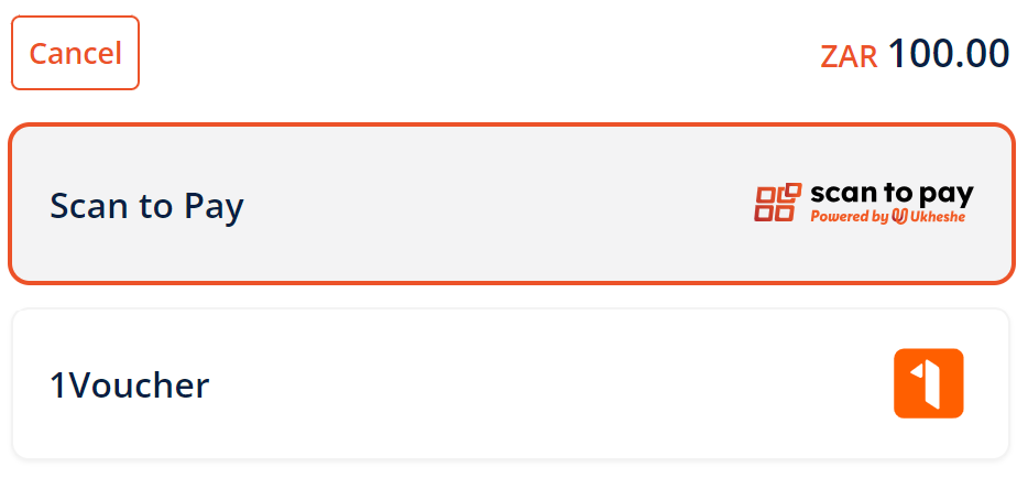
Embedded Checkout with primary colour set to orange.

Pay Now button with primary colour set to orange.
-
Brand secondary: Not used.
-
Cards background: Controls the payment method card background colour.
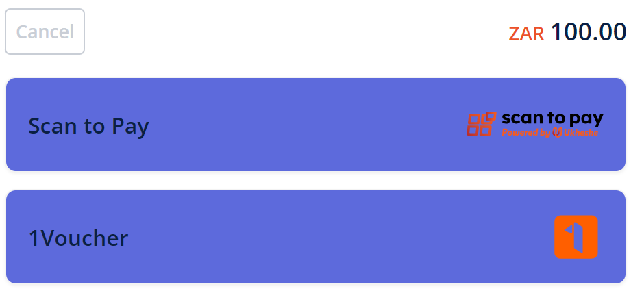
Embedded Checkout with payment method card background colour set to blue.
-
Cards background hover: Controls the payment method card background hover colour.
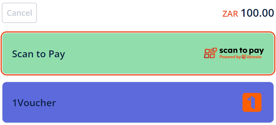
Embedded Checkout with payment method card background hover colour set to green.
Set the primary, secondary, and background colours as follows, ensuring that you use hexadecimal colour codes, for example, #000000 for black.
type Theme = {
  brand?: {
    primary?: string;
    secondary?: string;
  };
  cards?: {
    background?: string;
    backgroundHover?: string;
  };
};
Font
Embedded Checkout enables you to set the font to a web safe or Google font (Times New Roman, Monospace, and so on), which affects the currency, amount, cancel button, payment method names, footer, and payment method text elements.
- Apple Pay, Google Pay, and Samsung Pay buttons are logos and are not affected by font changes.
- The CVV and card number fields do not support certain fonts.
Embedded Checkout with the Monospace font.
type Theme = {
  fontFamily?: string;
};
Customise payment method availability and order
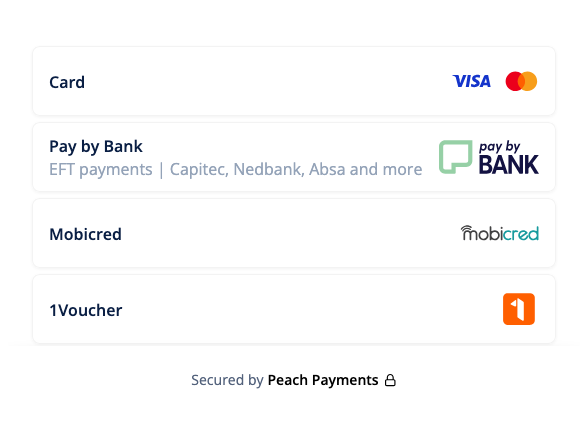
Embedded Checkout enables you to specify:
- Which payment methods to show to customers.
- The order of payment methods. This works by specifying an object with the payment method name and a number; lower numbers mean higher priority.
See the Payment methods section for more information on payment method parameter names.
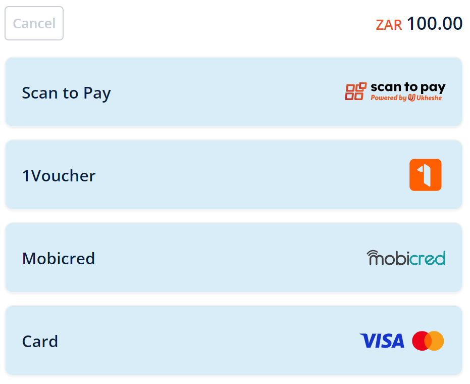
Example Embedded Checkout with custom colours and payment method order; note that not all payment methods are available in all regions or for all currencies.
options?: {
  ordering?: {
    MASTERPASS: 1;
    "1FORYOU": 2;
    MOBICRED: 3;
    MOBICRED: 4;
  };
  paymentMethods?: {
     include: ["MASTERPASS", "1FORYOU", "MOBICRED", "CARD"],
     exclude: ["PAYFLEX"],
  };
}
Customise Checkout user interface
You can customise the Checkout user interface using the customisations property. This provides a flexible and feature-rich way to control the user interface:
-
Basic user interface controls:
-
Show or hide the cancel button
-
Show or hide the amount field
Embedded Checkout with the cancel button and amount hidden.
-
-
Theme customisation (colours, and so on)
-
Card-specific customisations:
-
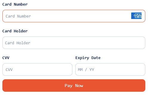
Custom submit button text (default:
Pay Now)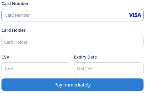
Custom submit button text.
-
Show or hide card icon (default: shown)
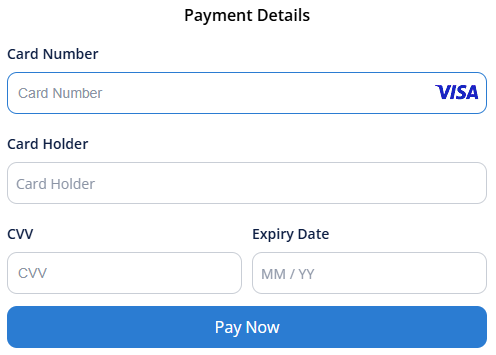
Card form with the card icon hidden in the title.
-
Enable or disable the add new card button (default: enabled)
-
Custom heading text depending on whether stored cards are available or not (default with no stored cards:
Please enter your card details below to complete the payment.| default with stored cards:Select a saved card or enter new card details.) -
Show or hide card brands (default: all brands)
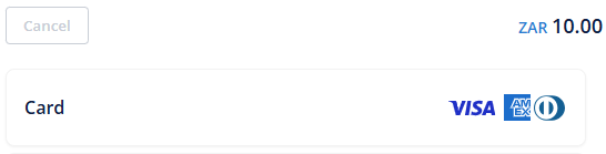
Card option with the Mastercard brand hidden.
-
Show or hide billing fields (default: shown)
-
Show or hide the CVV field when making a one-click payment (default: hidden)
-
Custom back button text when choosing to pay with a new card when stored cards are available (default:
Back)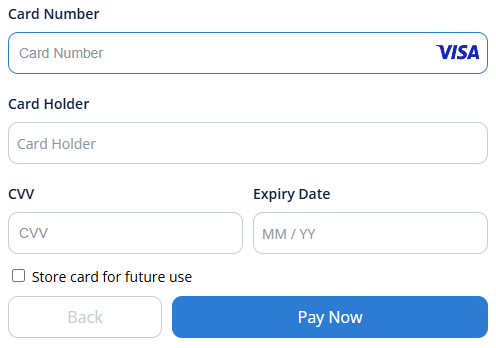
You can customise the back button text when choosing to pay with a new card when stored cards are available.
-
type Customisations = {
  showCancelButton?: boolean;
  showAmountField?: boolean;
  theme?: Theme;
  card?: {
    submitButtonText?: string;
    showCardIcon?: boolean;
    enableAddCard?: boolean;
    headingText?: {
      default?: string;
      savedCards?: string;
    };
    brands?: string[];
    showBillingFields?: boolean;
    registrations?: {
      requireCvv?: boolean;
      showStoredCardsText: string;
    };
  };
};Contact support to remove the billing fields from the Embedded Checkout card form.
Content Security Policy (CSP)
If your website uses a Content Security Policy, you must allow a range of directives.
Required CSP directives
Peach Payments provides the list of required CSP directives in two formats:
Add the directives from this list to your Content Security Policy.
Troubleshooting
If you see CSP violations in your browser console similar to:
Refused to load the script 'https://pnc43975.jscrambler.com/cc/1588655105.js'
because it violates the following Content Security Policy directive: "script-src 'self'"
Ensure that your Content Security Policy includes all domains from the Embedded Checkout CSP directives list in your directives.
Deprecation notice
These options still work, but Peach Payments strongly recommends that you use the updated options. Peach Payments intends to only add new features to the updated options.
Deprecated certain options in favour of new, more flexible options. The following sections describe the changes and how to migrate.
Event handling
Deprecated the events property in favour of eventHandlers:
// Deprecated
{
  events: {
    onCompleted: (event) => {
      /* ... */
    };
  }
}

// Use this instead
{
  eventHandlers: {
    onCompleted: (event) => {
      /* ... */
    };
  }
}
User interface customisation
Moved all user interface customisation options from options to the new customisations property:
// Deprecated
{
  options: {
    theme: { /* ... */ },
    enableCancelButton: false,
    enableAmountField: false
  }
}

// Use this instead
{
  customisations: {
    theme: { /* ... */ },
    showCancelButton: false,
    showAmountField: false
  }
}
This table provides a complete mapping of deprecated options to their new equivalents:
| Deprecated option | New option | Notes |
|---|---|---|
options.theme | customisations.theme | Theme configuration remains the same |
options.enableCancelButton | customisations.showCancelButton | Renamed for clarity |
options.enableAmountField | customisations.showAmountField | Renamed for clarity |
The new customisations property also includes extra features not available in the deprecated options, such as card-specific customisations.